Using Design Tokens in Lightning Web Components
Let's take a deep dive into what Design Tokens are, and how to use them in our custom Salesforce Lighting Web Components.

What's a Design Token?
Design Tokens are not something unique to Salesforce. They are used primarily in design systems, including the Salesforce Lightning Design System (SLDS), to help solve design continuity issues between platforms and products.
📢
JARGON ALERT:
You will often hear Salesforce Developers refer to the abbreviation "SLDS" as "Salads" when spoken aloud 🥗 🥗.
You will often hear Salesforce Developers refer to the abbreviation "SLDS" as "Salads" when spoken aloud 🥗 🥗.
For example, a company might have a public website, an Android and IOS App, and maybe even some internal web apps. Design tokens provide an abstract way to define things like colors, typography, spacing, and other design properties unrelated to any given platform or technology. Now web developers who are using the design system can use design tokens in the form of CSS or Sass/Less variables. While native app developers might access them as variables in the form of a JSON or YAML file.
This ensures consistency in the look and feel across the different platforms, but it also helps with maintainability. When the design team decides that the token representing the "primary brand color", for example, needs to change. They need to change it in only one place. All of the websites and applications that use the design system should be able to pull in the changes automatically.
"With design tokens, you can capture low-level values and then use them to create the styles for your product or app. You can maintain a scalable and consistent visual system for UI development."
Jina Anne
Lead Designer of the Salesforce Lightning Design System
SLDS Design Tokens
The Design Tokens page in the SLDS documentation is really informative but can be a bit confusing for Salesforce Developers. Part of the reason for this is that it is written to a broader audience than just developers wiring Lightning Web Components (LWC) within the platform.
Design Tokens - Lightning Design System

Just know that the purpose of this page is to explain what design tokens are available, what their values are, and their appropriate usage. It's a great place to come when you want to know if a token exists, but it's not intended to be a guide for how to implement them in your code. We'll get into that in just a bit.
For now, we will just look at a few important parts of this documentation. First of all, when the page loads, the default format is set to "Sass". We can't really use Sass design tokens in LWC, so be sure to change the option to "Lightning"
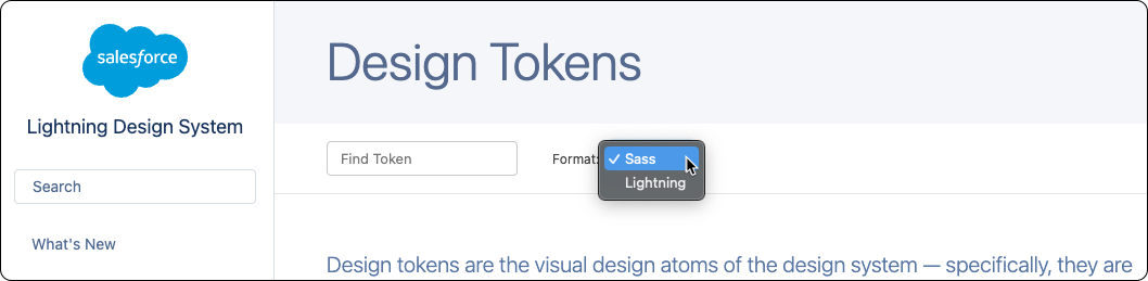
ℹ️
Sass, if you don't know, is a preprocessor for CSS that extends the functionality of CSS by adding features like variables, mixins, and nesting. It makes writing and maintaining CSS easier and more efficient by allowing you to write more concise and reusable code.
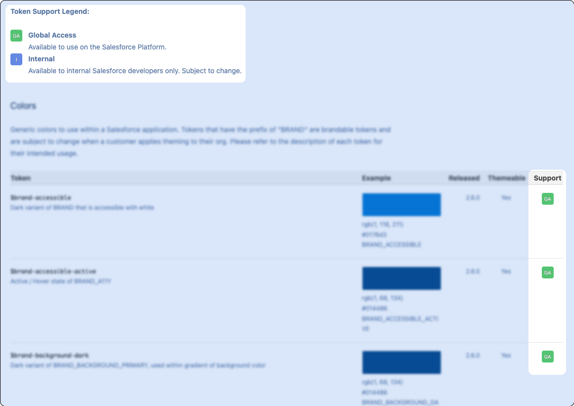
The next thing to call out here is the Token Support Legend. This will tell you which design tokens are available for use in our Lightning Web Components. In theory, we can use any token with the green GA badge next to it. I say in theory because there was a time where some tokens marked as GA were not accessible in LWC, but I believe that bug has been fixed.
Using Design Tokens in LWC
Within a Lightning Web Component, design tokens will work just like any other CSS Variable.
If you don't already have a .css file in your Lighting Web Component's folder, you can simply create a new CSS file in your editor. Be sure and name it the same name as the other files in the folder, but with a .css extension. Open the CSS file.
Now you can grab any of the design tokens with a GA badge and use it in your CSS. However, the SLDS Design Tokens page is confusing because currently, it shows the t function syntax. These functions were intended to be used with Aura Components and are not valid syntax for LWC. The only part you need to worry about is what is in between the t( and the ). Then, in your CSS, you will wrap that value in var(--lwc- and )

This might seem confusing, but it's actually all native CSS. the var function is plain 'ol vanilla CSS and the syntax is always var(--my-variable-name). The variable name always starts with a double hyphen (--), and uses kebab case.
SLDS is responsible for resolving the CSS variable --lwc-spacing-small to the appropriate design token because, presumably, the Design System generated the CSS documents that "live" inside of Salesforce.
So this code...
div {
    margin-right: var(--lwc-spacingSmall);
}
...adds a right margin to all of the <div>s in our component. How much margin? Well, how ever much the design token says. That's the beauty of design tokens. We don't need to know how a token is defined in order to use it. We can trust that the design system will resolve the token to the desired value. If the designer's over at Salesforce decide to change the definition of spacingSmall from .75rem to .85rem, our component will automatically inherit those changes.
By the way that code would be 100% equivalent to this markup...
<template>
    <div class="slds-var-m-right_small">
        ...
    </div>
</template>
... because the class slds-var-m-right_small is actually using var(--lwc-spacingSmall) under the hood.
So When Should We Use Design Tokens?
This is a very valid question and one that I wish more engineers would ask themselves. Now that we have these shiny new design tokens, it can be tempting to over use them.
We just saw how the slds-whatever CSS classes are already using design tokens behind the scenes; why not use those classes in our markup, rather than design tokens in our CSS? In my opinion, this should be our default. I think it makes our code easier to read and more intuitive. Using design tokens should be more the exception than the rule.
Complex Custom User Interfaces
Where design tokens really shine is when you are creating new, complex UIs. For example, if you were to create a Gantt Chart LWC from scratch, you will likely need quite a bit of custom CSS. It is in these custom CSS rules that you would want to use SLDS design tokens rather than hardcoding your own values. Here's an example:
...

.gantt-view {
  display: flex;
  flex-direction: column;
  justify-content: space-between;
  padding: var(--lwc-spacingXSmall);
  background-color: var(--lwc-colorBackgroundAlt);
}

.gantt-is-today {
  border-color: var(--lwc-brandPrimary);
  border-style: solid;
}

.gantt-row-header {
  background-color: var(--lwc-colorBackground);
}

...
This gives us a lot of control over how the UI will render but still allows our custom components to conform to Salesforce's design language. And as we covered earlier, if any of the underlying values for these design tokens were to change in a future platform release, our custom components will automatically reflect those changes.
Styling Hooks
We've seen how you can use design tokens in your components, now let's take a look at how you can redefine them.
Many of the standard Lightning Web Components allow you customize their styling through something called Styling Hooks. This is just a fancy way to describe changing, or redefining the value associated with a design token, which in the case of LWC development, really means that we are redefining a CSS variable.
Take the card component for example. The documentation mentions how to override the component styling. It provides a link to the SLDS Card blueprint which has a list of all of the design tokens used by the card component. You will find that most of the standard components will have similar documentation.
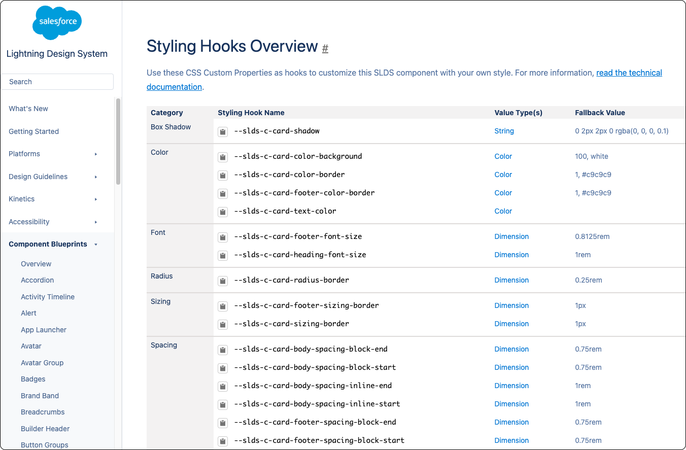
As you can see, --slds-c-card-color-background is a design token used in the card component and therefore, we can override it. Consider the following HTML:
<template>
    <lightning-card  title="First">
        <p>The First Card</p>
    </lightning-card>
    <section class="call-to-action">
        <lightning-card  title="Second">
            <p>The Second Card</p>
        </lightning-card>
        <lightning-card  title="Third">
            <p>The Third Card</p>
        </lightning-card>
    </section>
    <lightning-card  title="Fourth">
        <p>The Forth Card</p>
    </lightning-card>
</template>If we wanted to change the background color for all of the card components in our custom component, we can add this to the CSS file:
:host {
    --slds-c-card-color-background: green;
}You see how we are able to redefine what --slds-c-card-color-background
ℹ️
:host is a special CSS pseudo-class used to target the entire shadow DOM host. Perhaps I'll do a deep dive on the shadow DOM in a future post, but for now, just know that this selector will target everything in your custom component.But what if we wanted to effect only certain instances of the card components. There are several ways to pull this off using the cascading nature of CSS; but the simplest way would be the following:
.call-to-action {
    --slds-c-card-color-background: green;
}This time, instead of using :host, we care using .call-to-action for the selector. The name of this class doesn't matter, but if you look back in the HTML, we wrapped cards 2 and 3 in a <section> tag that has a class of call-to-action.
The result here should be that the first and forth cards have the default background color of white, while the second and third cards will have a green background.
Final Thoughts
I hope this explanation of how design tokens work in Salesforce has been helpful. Please let me know in the comments if anything is unclear or if you have any questions. Thanks!
Read More
You can read more about using Design Tokens here:
https://developer.salesforce.com/docs/component-library/documentation/en/lwc/create_components_css_design_tokens
You can read more about using Styling Hooks here:
https://developer.salesforce.com/docs/component-library/documentation/en/lwc/lwc.create_components_css_custom_properties